A brief tour of data wrangling for psychologists in python
By using python for data analyses, you win:
- A real programming language (i.e. more transferable skill)
- Beauty, elegance, readability, in short the zen of python (ex?)
- The ultimate glue/scripting language
- Usually more straightforward to do non-statistical tasks in Python (than in R), e.g. fancy preprocessing, string processing, web scraping, file handling,...
- Connections to many well-developed scientific libraries: numpy (matrix computations), scipy (scientific computing), scikit.image (image processing), scikit.learn (machine learning),...
- Interactive notebooks! (because the paper is getting obsolete)
You lose:
- Switch cost (often considerable for non-professional programmers) when you program experiments in python anyway
- Basic data analysis functionality that is not built-in but available through libraries (even more modular than R)
- Specific advanced analysis techniques not available (others, such as machine learning tools are often better supported in python). This is rapidly improving, but still more in alpha/beta stage instead of finished/tested/documented libraries.
- The large knowledge base/support (as a statistics tool) that R has (e.g. in the department)
But lots of commonalities in the logic of data wrangling, plotting & analyzing
No reason to choose, you can use both depending on your needs or processing stage. For example:
- You wrote your experiment in python and want to do some preliminary preprocessing or (descriptive) analyses on single-subject data immediately after this individual is tested. You don't need to switch to R (the psychopy trialHandler gives you immediate access to a pandas dataframe of your data).
- You want to automatize some operation on files such as datafiles, images, etc. (renaming, reformatting, resizing, or equating images on some feature) or on strings in files (eg your recorded data does not have the right formatting). This is easier in python.
- Then you want to take advantage of tidyverse/ggplot2, you switch to R.
- You want to do a (generalized) mixed model or Bayesian analysis, you stay in R.
- You like to apply a fancy machine learning algorithm to your data, you switch to python again.
All steps can be done in either language but effort/support differs depending on case.
In python statistical functionality is not built-in...
Useful python packages for psychologists
In order of importance:
- Jupyter notebooks or better: Jupyterlab (the Rstudio of python, with interactive "shiny app"-like functionality)
- pandas: data handling & descriptive analyses,
- Plotting: matplotlib (~R base plotting), seaborn (written by a cognitive neuroscientist) and/or plotnine (ggplot2 alternative)
- statsmodels: statistical models (glm, t-tests,...)
- Specialized analyses: Psignifit (psychometric function fitting), Bambi/Kabuki (hierarchical bayesian models), NIPY, MNE, PyMVPA
- More libraries
import numpy as np
import matplotlib as mpl
import matplotlib.pyplot as plt # roughly ~base R plotting functionality
import pandas as pd #roughly ~base R & tidyr functionality
import seaborn as sns #roughly ~ggplot2 functionality
import statsmodels.api as sm
import statsmodels.formula.api as smf
import warnings
warnings.filterwarnings('ignore')

#to make the plots appear inline, and saved in notebook:
%matplotlib inline
sns.set_context("talk") # seaborn function to make plots according to purpose (talk, paper, poster, notebook)

# We'll show people what versions we use
import datetime
now  = datetime.datetime.now().isoformat()
print('Ran on ' + now)
import IPython
print(IPython.sys_info())
!pip freeze | grep -E 'seaborn|matplotlib|pandas|statsmodels'
Pandas for data wrangling

Multiple great tutorials already exist on how to handle, clean and shaping data into the right format(s) for your visualizations and analyses in python. I was helped by the 10 minutes to pandas tutorial, this brief overview, I still regularly need to check this cheat sheet, and of course google/stackoverflow gives you access to the very bright and helpful python data science community.
If you want a more thorough explanation of pandas, check this book on python for data analysis or this Python Data Science Handbook.
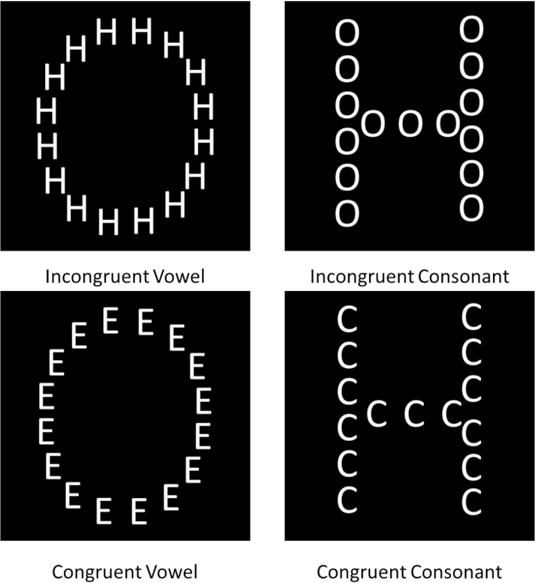
Rather than rehash what's in those works, we will learn by example using the data from a Navon experiment with hierarchical letters probing precedence and interference of global processing. For more background and a description of the experiment, see Chamberlain et al. (2017):
"The Navon task was a modified version of a hierarchical letter paradigm (Navon, 1977), designed to reduce the potential influence of factors confounding global processing such as spatial location and variation in shape characteristics. Participants were required to distinguish whether a global letter shape made up of local letters or the local letters themselves were vowels or consonants (Fig. 1). Vowel and consonant letter shapes were kept as comparable as possible. There were 5 consonant types (C, D, F, H, T) and 5 vowel types (A, E, I, O, U). Trial congruency was defined by the category type (vowel/consonant). In some congruent trials the exact letter identity matched between local and global stimulus levels, whilst in all other congruent trials only the category type matched. Presentation location of the test stimulus was randomized on a trial-by-trial basis, in order to eliminate the ability of participants to fixate on local spatial locations to determine global shape. The stimulus was presented in one of four corners of a 100x100-pixel square around central fixation. There were 10 practice trials followed by two blocks of 100 experimental trials. In alternate blocks whose order was randomized, participants were instructed to either focus on the global letter shape (global selective attention) or on the local letter shapes (local selective attention) and press the ‘J’ key if the letter was a vowel, and the ‘F’ key if the letter was a consonant. Each trial began with a fixation cross presented for 1000 ms. The fixation cross then disappeared and was followed by the experimental stimulus (a white letter shape on a black background). The stimuli were presented for 300 ms followed by a 4 s response window. Feedback was presented in the form of a coloured (red/green) fixation cross which also encouraged central fixation for the next trial. Both accuracy and reaction time(s) were recorded. Stimulus presentation and data collection were controlled using the Psychopy package (Peirce, 2007) and stimuli were created using the MATLAB toolbox GERT (v1.20) (Demeyer & Machilsen, 2012)."
Reading in our data...
!pwd
!ls data/ #we can use shell commands to see where the data is (ls=dir on windows)
import glob, os #to work with paths

df = pd.DataFrame()
folders = ['CO10','CO12'] # the raw data is in two different folders

for folder in folders:
    if folder=='CO10': sep=';' #data in different folders use different field separators
    else: sep=','

    all_files = glob.glob(os.path.join('data', folder, "*.csv")) # get list of individual data files
    df_from_each_file = (pd.read_csv(f,  sep=sep, index_col=0) for f in all_files)
    concatenated_df = pd.concat(df_from_each_file, ignore_index=True)
    df = df.append([df,concatenated_df])

df.head()
# add demographics
all_files = glob.glob(os.path.join('data', "*.csv"))
df_from_each_file = (pd.read_csv(f,  sep=sep, index_col=0) for f in all_files)

dfdemo = (pd.concat(df_from_each_file, ignore_index=True, axis=0)
            .drop_duplicates(['Subject'], keep='first', inplace=False) # drop duplicate rows for subjects
            .sort_values('Subject')
         )

dfdemo.head()
Note the method chaining in the example above. Most pandas methods return a DataFrame so that another pandas method can be applied to the result (with the dot formulation). Using the pandas-ply library you can also use dplyr style piping in pandas. Depending on how you value code readability, performance or debugging you'll prefer one or the other.
print dfdemo.age.value_counts()
print df.groupby(['participant']).age.apply(lambda x: x.iloc[0]).value_counts()
# age column is the same between dfs so we can drop it in the original data before merging
df=df.drop(['age'], axis=1)
df= pd.merge(df, dfdemo, how='left', left_on='participant', right_on='Subject')
df.head()
sns.distplot(df.age.dropna(), kde=False);

Dataframe characteristics
print 'Variables:\n', df.columns
print 'variables:\n', df.dtypes
print 'nb of participants:', len(df['participant'].unique())
print 'trials per participant:', len(df)/ len(df['participant'].unique()) #not exactly
Cleaning data
# rename a variable/column
df = df.rename(columns={'acc_raw': 'acc', 'rt_raw': 'rt'})
#properly format RTs (dot notation)
df['rt'] = df['rt'].apply(lambda x: str(x).replace(',','.')).astype('float64')
# fill in missing values
df.loc[df.rt<0,['rt']]= np.nan
# we have 2 gender columns now, how do they compare?
df.gender_x.value_counts()
# Correcting values in gender column
df.loc[df['gender_x'] == 'vrouw', 'gender_x'] = 'F'
df.groupby('gender_x')['participant'].nunique()
# check gender stats
df.groupby('gender_y')['participant'].nunique()
# count missing values
df.isnull().sum()
# Save merged data
df.to_csv('dfmerged.csv')
# Save merged data
df = pd.read_csv('dfmerged.csv')
Group by: split-apply-combine
Common operation:
- Splitting the data into groups based on some criteria
- Applying a function to each group independently
- Combining the results into a data structure
Can be about:
- calculating some aggregate measurement for each group (agg(function), size(), mean(), apply(function), rolling(), etc.)
- filtering the rows on a property of the group they belong to (filter())
- calculating a new value for each row based on a property of the group (transform()), e.g. create a column with Z-scores
It helps to start with the result you want, and work backwards from there. If you want to get a single value for each group, use aggregate(), apply() (or one of the shortcuts). If you want to get a subset of the original rows, use filter(). And if you want to get a new value for each original row, use transform(). Check this page for some more advanced groupby recipes. Note that apply() is most flexible because it can implement an aggregate or a transform, and anything in between. Examples follow...
df.groupby(['cond', 'congruence']).acc.mean() #.reset_index()
Insert a column with standardized RT:
zscore = lambda x: (x - x.mean()) / x.std()
df.insert(17, 'Zage', df.groupby(['participant'])['age'].transform(zscore))
Removing outliers
# proportion of incorrect trials
1-df.acc.mean()
sns.distplot(df.groupby(['participant']).acc.mean(), bins=20);

Get help on how to use a method:
?sns.distplot()
Or just press shift-tab when cursor is on a method/module to view info. Note that you can find all jupyter lab commands in the left panel, under the Commands tab. You can also open a console (file-> view console for notebook) to quickly try out some code before entering them in a cell.
Remove participants with mean accuracy lower than (mean acc - 2.5*std of accuracy)
df = df.groupby('participant').filter(
    lambda x : x['acc'].mean() > df.acc.mean()-(2.5*df.groupby(['participant']).acc.mean().std()))

print len(df.participant.unique())
sns.distplot(df.groupby(['participant']).acc.mean(), bins=20);

RT analysis
# discard incorrect trials for RT analyses
dfrt = df[df.acc==1]
sns.distplot(dfrt.rt);

Remove participants with mean rt lower than (overall mean rt - 2.5*std of rt)
dfrt = dfrt.groupby('participant').filter(
    lambda x : x['rt'].mean() < df.rt.mean()+(2.5*df.groupby(['participant']).rt.mean().std()))

print len(dfrt.participant.unique())
sns.distplot(dfrt.rt);

One could define outlier RTs on the individual level as well...
len(dfrt)
dfrt = dfrt[dfrt.groupby('participant').rt.transform('mean') +(2.5*dfrt.groupby('participant').rt.transform('std')) > dfrt.rt]
len(df)
sns.distplot(dfrt.rt);

fig, ax = plt.subplots()
conditions = ['congruent', 'incongruent']

for condition in conditions:
    condition_data = dfrt[(dfrt['congruence'] == condition) & (dfrt['cond'] == 'selAttGlob')]['rt']
    sns.kdeplot(condition_data, shade=True, label=condition)

sns.despine()

More ways to explore RT distributions.
# summary statistics of RT per condition
dfrt.groupby(['condition','cond','congruence']).rt.describe()
Seaborn for visualization
- Attractive and informative statistical graphics in Python.
- With minimal effort or tweaking (often work on the full dataset instead of summary)
- Invites quick exploration (supports violins, swarms, boxes, lines, bars, strips, heatmaps, faceting...)
- Tuned to the needs of psychologists (made by a cognitive neuroscientist)
- A gallery of what's possible.
g = sns.factorplot(x="condition", y="rt", hue="congruence",
               col="cond", unit='participant', data=dfrt, kind="point");

g.set(xlabel="Condition", yticklabels=[y for y in  np.linspace(0,.6,6)]);

Some features of Seaborn plots:
- Factorplot is a categorical, faceted plot: "It is important to choose how variables get mapped to the plot structure such that the most important comparisons are easiest to make. As a general rule, it is easier to compare positions that are closer together, so the hue variable should be used for the most important comparisons".
- Note the unit parameter: Identifier of sampling units, which will be used to perform a multilevel bootstrap for the confidence intervals (errorbars) and account for repeated measures design.
- Hence, you can input the full dataset
- The default errorbar is 95% ci, but you could set it to another size, or to sd or to none
- The default estimator plotted is the mean, but this can also changed to any summary function.
- The kind parameter can be set to {point, bar, count, box, violin, strip}. But you can also call the base function, e.g. boxplot() (see example below)
- Seeing that seaborn is built on top of matplotlib, you can always further customize plots using matplotlib methods (see example below).
# we could define a function for saving plots for use outside of notebook (e.g. in paper)
def save_fig(fig, figname):
    if not os.path.exists('figs'):
        os.makedirs('figs')
    fig.savefig("figs/%s.pdf" % figname, dpi=300) #high dpi for printing
    fig.savefig("figs/%s.png" % figname, dpi=300)
    fig.savefig("figs/%s.svg" % figname, dpi=300)
dfsum = dfrt.groupby(['participant', 'congruence', 'cond']).rt.mean().reset_index()
g = sns.boxplot(x="cond", y="rt", hue="congruence", data=dfsum);
g.legend(loc="upper left");
save_fig(g.get_figure(),'box')

Compute difference scores (interference) and plot distributions
def interference(group):
    return group[group.congruence=='incongruent'].rt.mean()-group[group.congruence=='congruent'].rt.mean()

dfIF = dfrt.groupby(['participant','cond']).apply(interference).reset_index()
dfIF = dfIF.rename(columns={0: 'interference'})

dfIF.head()
sns.swarmplot(x="cond", y="interference", data=dfIF);

sns.set_context("poster", font_scale=1.3)
sns.set_palette('deep') # options: deep, muted, bright, pastel, dark, colorblind

fig, ax = plt.subplots(figsize=(10, 6))
conditions = ['selAttGlob', 'selAttLoc']

for i, condition in enumerate(conditions):
    condition_data = dfIF[(dfIF['cond'] == condition)]['interference']
    sns.distplot(condition_data, label=condition);
    ax.axvline(x=dfIF[(dfIF['cond'] == condition)]['interference'].mean(), linestyle='--', color= sns.color_palette()[i])

# embellish plot
sns.despine()

ax.set_title('Navon interference on reaction times')
ax.set_xlabel("Interference")

# Improve the legend
handles, labels = ax.get_legend_handles_labels()
ax.legend(handles, ['local interference', 'global interference'], loc="best");
save_fig(fig, "interference")

For more customization options, see the seaborn tutorials. More flexibility is provided by the matplotlib core: a cheat sheet.
Let's do a quick t-test...
from statsmodels.stats.weightstats import ztest

out = ztest(dfIF[dfIF.cond=='selAttLoc']['interference'], value=0)
print "t-test for global interference different from zero:\nt = ", round(out[0],2), "p = ", round(out[1],4)
out = ztest(dfIF[dfIF.cond=='selAttGlob']['interference'], value=0)
print "t-test for local interference different from zero:\nt = ", round(out[0],2), "p = ", round(out[1],4)
Luckily these conclusions are consistent with those reported in the paper...
Or a mixed model...
md = smf.mixedlm("rt ~ congruence * cond", dfrt, groups=data["participant"])
mdf = md.fit()
print(mdf.summary())
Accuracy analysis
sns.factorplot(x="condition", y="acc", hue="congruence",
               col="cond", unit="participant", data=df, kind="point");

Incidentally, it is possible to use latex in your markdown, for example, drop that Bayes!
$ P(A \mid B) = \frac{P(B \mid A) \, P(A)}{P(B)} $
Just kidding, I'm not going to show you how to do a Bayesian analysis on these data...
I would like to do a logistic mixed model on the accuracy data, but unfortunately statsmodels does not yet support those.
Statsmodel has an alternative method to deal with clustered data: Generalized Estimating Equations (GEE). GEEs have a few attractive advantages over hierarchical linear models (“mixed models”), for example fewer assumptions about the random effects and more intuitive interpretation of coefficients. Especially for discrete dependent variables (i.e., our binary accuracy data) the likelihood-based mixed models can show difficult convergence and a lack of robustness to misspecification of the covariance structure. See also: McNeish, D., Stapleton, L. M., & Silverman, R. D. (2016). On the Unnecessary Ubiquity of Hierarchical Linear Modeling. Psychological Methods.
# model formulation
fml = "acc ~ cond * congruence"

# covariance structure
ex = sm.cov_struct.Exchangeable()
#link fu
fa = sm.families.Binomial(sm.families.links.logit)

model = sm.GEE.from_formula(fml, "participant", df, cov_struct=ex, family=fa)
result = model.fit()
print(result.summary())
print(result.cov_struct.summary())
But reviewer #2 demands a conventional GLMM...so let's use R
Interfacing between R and python
Option 1: R interface to python
- Using library(reticulate)
- Add python code chunks in your Rmarkdown (but no autocomplete so best used sparingly)
- Read in python source files and call its functions
- Automatic variable conversion: e.g. R dataframe becomes pandas dataframe (and vice versa)
- Import python modules from within R and call its functions in the usual R way ($)
Option 2: Open the R kernel in jupyterlab
- Same environment but separate analyses
- Actual R notebook (jupyteR!)
- No real integration: you still rely on writing/reading files
Option 3: Python interface to R
- Using rpy2 library (conda install rpy2 into the Anaconda terminal)
- Make a full cell (or a line) of R (by "magic")
- Automatic variable conversion: Pandas dataframe becomes R dataframe (and vice versa)
- Load R libraries
import rpy2.rinterface

%reload_ext rpy2.ipython
%R -n require(lme4);
%R -n require(tidyr); require(ggplot2)
A killer feature of Jupyter notebooks are magic commands.
- These commands, prefaced with a '%', add some extra power over top of the typical Python syntax to solve common problems that may arise. More about magic commands. We focus on R here but Magic commands are for example also available for javascript plotting in Jupyter.
- %load_ext magic command loads the rpy2 jupyter extension into the notebook, essentially initializing the R interface and allowing the notebook to connect and pass objects between the two languages. This magic command needs only to be run once.
- Double "%" signs affect the whole cell (jupyter code block), for example making it an R code block.
%%R
# ^ Tells the notebook that this code cell is actually R

# Now we can write R code as if this were an R notebook
X_vals <- c(1, 2, 3, 4, 5)
y_vals <- c(1, 2, 4, 8, 16)

plot(X_vals, y_vals,
     col='purple', pch=12,
     main='R plot in Python')

Passing variables back and forth
- A variable listed after -i on the %%R line will be inputted and converted to an R object from Python.
- A variable listed after -o on the %%R line will be outputted and converted from an R object to a Python object.
np.random.seed(42)
# Make a pandas DataFrame
testdf = pd.DataFrame(np.random.normal(0,1,size=(100, 3)), columns=list('ABC'))
testdf['C'] = testdf['C'] + 2
testdf.head()
%%R -i testdf
testdf %>%
  gather("Category", "X") %>%
  ggplot(aes(x = Category, y = X, fill = Category)) +
    geom_violin() +
    stat_summary(fun.y=mean, color='black', geom='point', size = 3) +
    theme_bw()

But why not stay in python ;-)
dfmelted = pd.melt(testdf, value_vars=["A","B","C"], var_name="category", value_name="X")
print dfmelted.head()
dfmelted["xbin"] = dfmelted.X > .5

sns.violinplot(x="category", y="X", data=dfmelted, inner="quart");

Note that we used the pandas melt function to go from a dataset in the wide form (testdf above) to long form (done in R with the melt or gather function). There are many more reshaping and pivoting functions in pandas, which we won't cover. The best way to get a feel for the pandas reshape and pivot functions is to go through this brief visual guide. Further details can be found in the pandas documentation.
Still prefer the ggplot syntax?
from plotnine import *

(ggplot(dfmelted, aes(x = 'category', y = 'X', fill = 'category'))
    + geom_violin()
    + stat_summary(fun_y=np.mean, color='black', geom='point', size = 3)
    + theme_bw())

But we wanted a GLMM on our accuracy data...
dfreduc=df.iloc[:5000]
dfreduc.head()
%%R
lr.test = function(m1, m2, name){
    print(summary(m1))
    print(summary(m2))
    out = anova(m1, m2)
    chi2 = out$Chisq[2]
    dof = out$"Chi Df"[2]
    p = out$"Pr(>Chisq)"[2]
    test_str = "Likelihood ratio test for %s:\n  Chisq(%d) = %.2f; p = %.3g"
    writeLines(sprintf(test_str, name, dof, chi2, p))
}
%%R -i dfreduc
m = glmer(acc ~ cond * congruence + (1 | participant), dfreduc, family=binomial)
m.null = glmer(acc ~ cond + congruence + (1 | participant), dfreduc, family=binomial)
lr.test(m, m.null, "interaction effect of selective attention * congruence")
%%R -i dfrt
m = glmer(rt ~ cond * congruence + (1 | participant), dfrt)
m.null = glmer(rt ~ cond + congruence + (1 | participant), dfrt)
lr.test(m, m.null, "interaction effect of selective attention * congruence")
Conclusion: It's easy to do data management and manipulations in python, but briefly switch to R for some analysis or visualization that is better supported in R (or vice versa with reticulate).
Sharing/exporting notebooks
- Export as (see file-menu) html, pdf, markdown, latex...
- Push to github and people can see a pretty-printed but static version (see the current notebook)
- Use nbviewer to create a rendered, static version of your notebook
- Use Binder to create a collection of interactive, linked notebooks
Sources
Aside from the examples, this tutorial is basically a mashup of sections of these sources:
https://github.com/ujjwalkarn/DataSciencePython
Data wrangling
- Jupyter notebook tutorial
- Interactive pandas tutorial
- Basic pandas tutorial
- Basic tutorial pandas in notebook
- Preprocessing issues
- Tidy data in python
- http://www.jeannicholashould.com/tidy-data-in-python.html
Jupyter notebook/lab
R & python
- use R in jupyter notebooks.
- https://github.com/JaredStufft/instructionals/blob/master/Interfacing%20R%20from%20a%20Python%20Notebook.ipynb
- https://gist.github.com/simecek/019d87c55fec3839d95bbf8489dde61d
Visualization
- https://dsaber.com/2016/10/02/a-dramatic-tour-through-pythons-data-visualization-landscape-including-ggplot-and-altair/
- http://pbpython.com/python-vis-flowchart.html
- http://pythonplot.com/
- http://pbpython.com/visualization-tools-1.html
- https://www.dataquest.io/blog/jupyter-notebook-tips-tricks-shortcuts/
- https://tomaugspurger.github.io/modern-6-visualization
- Advanced pandas/seaborn tutorial
- https://www.marsja.se/response-time-distributions-using-python/
- Understanding Matplotlib
- https://towardsdatascience.com/interactive-visualizations-in-jupyter-notebook-3be02ab2b8cd